The Planbureau voor de Leefomgeving (PBL) is the national institute for strategic policy analysis in the field of the environment, nature, and spatial development. As an independent advisory organization, the PBL supports policymakers with scientific insights, facts, and figures that contribute to sustainable and future-proof choices.
The challenge
The PBL's mission is to translate complex scientific information into insights that are clear and accessible to both policymakers and a wider audience.
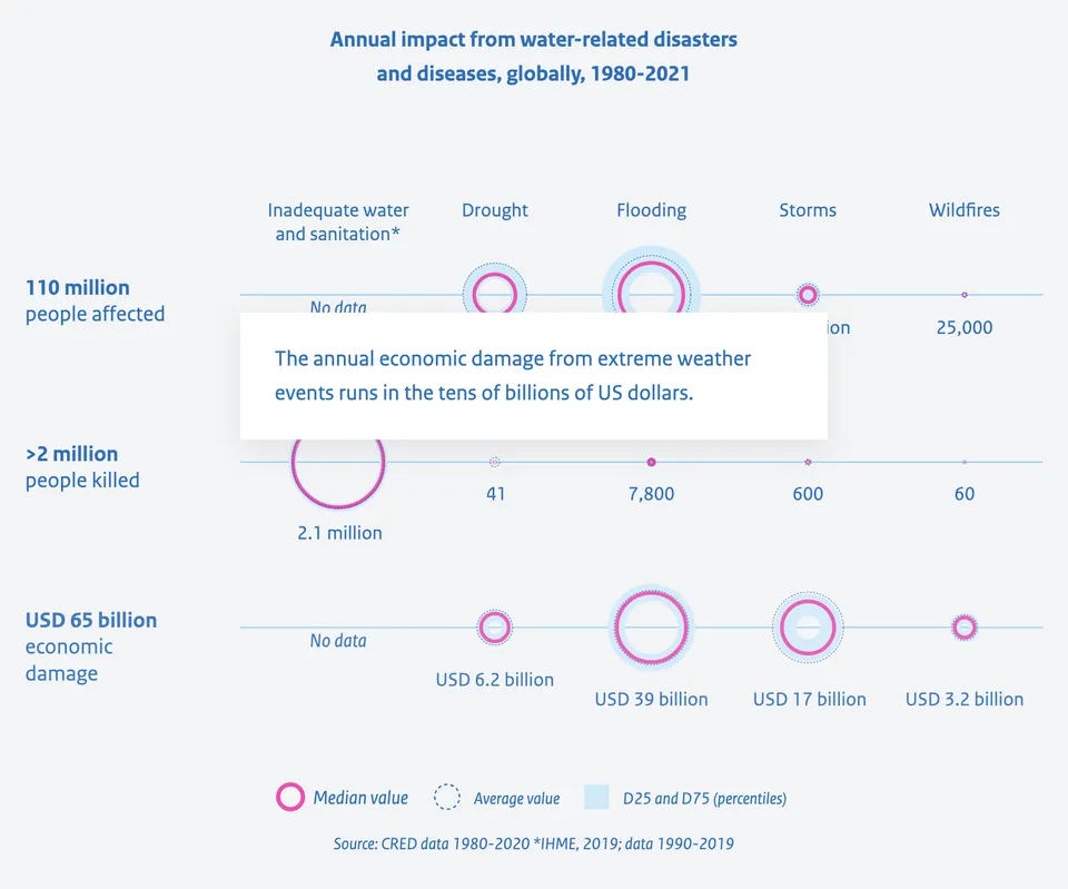
For global water and climate issues, they have done this by translating thorough scientific research into three publications with six substantive themes, supported by a large number of infographics and maps.
Leukeleu was called in, together with JohnVenn and Wilfried ten Brinke, to work closely together to develop the narratives in order to convey the main messages of the publications in a clear and concise manner to policymakers and the general public in terms of content, graphics/interactivity, and technology.
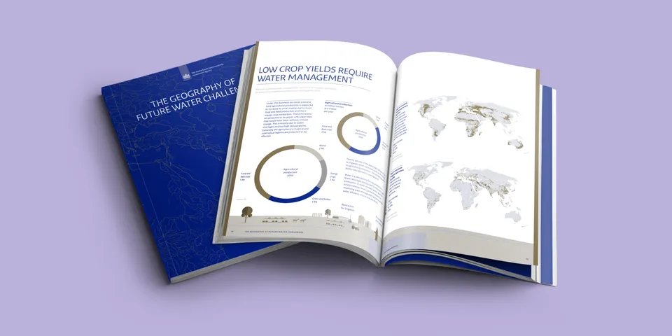
356 pages with 500+ infographics and maps
2018
The geography of future water challenges (104 pages) is the first publication produced by PBL in collaboration with Wilfried ten Brinke (ClimateChangePost) and a team of designers led by Karin Schwandt (JohnVenn).
2023
The sequel in the form of The Geography of Future Water Challenges - Bending the Trend (216 pages) and a Policy Summary in the context of the UN 2023 Water Conference (36 pages).
Highlights
- alignment with the visual language of the publications
- for (inter)national policymakers and the general public
- knowledgeable translation of global water issues
- responsive (desktop/laptop/mobile)
- experience with infographics and narratives related to global water issues
- accessibility requirements of the national government
“ What I particularly appreciate about Leukeleu is the flexibility within the well-designed process. As customers, we often want to ‘rush through’ it. Yet Leukeleu maintains calm and clarity. That is greatly appreciated. ”
Arno (product owner)
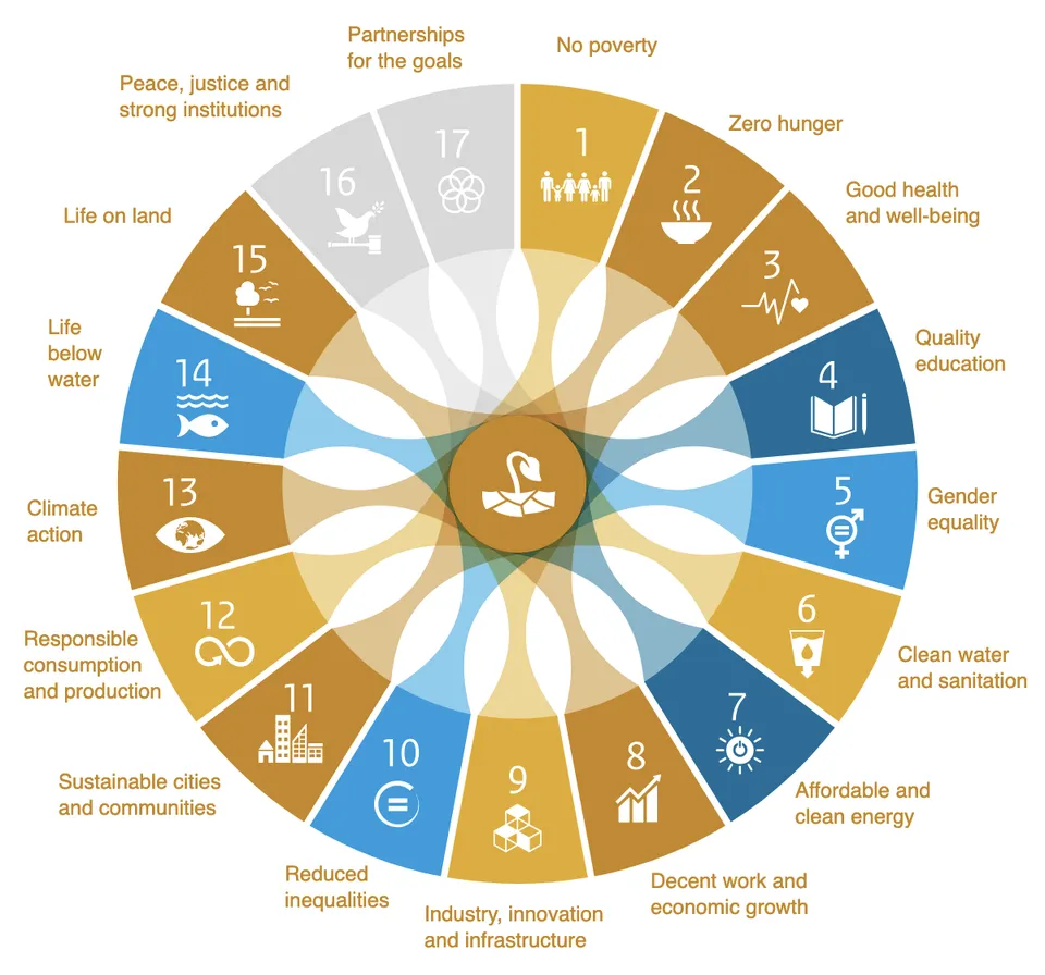
Interactive infographics: SDG wheel
The 17 Sustainable Development Goals (SDGs) are the world's best plan to build a better world for people and our planet by 2030. The SDGs were adopted in 2015 by all member states of the United Nations and are a call to action for all countries—poor, rich, and middle-income—to promote prosperity while protecting the environment.
We created an interactive tool from this SDG wheel that allows content creators to put together their own version.
Optimal usability anytime, anywhere
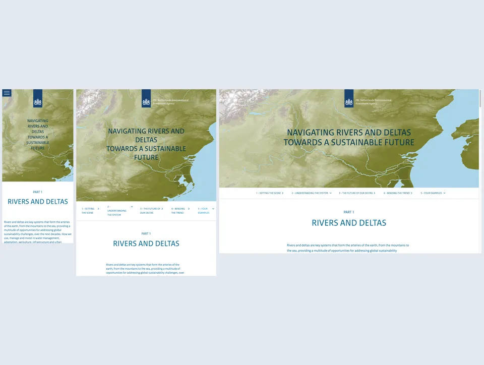
Nowadays, responsive design is not a nice-to-have, but a must. Whether your user is working on a smartphone, tablet, laptop, or desktop, the experience must always be right. In this customer case, the challenge was not only to scale the content, but also to make interactive infographics, animations, and accessible navigation responsive. Thanks to a well-thought-out approach and extensive testing, the interface feels familiar on any screen size. This is reflected in the ease of use and satisfaction of end users.
Accessible to everyone
Accessibility is not an extra, but a basic requirement – especially for (semi-)governmental organizations. In this customer case, we ensured that the application fully complies with the accessibility requirements according to WCAG 2.1 (EN 301 549). This means that it is easy to use for everyone, including people with disabilities. Think of sufficient contrast, keyboard navigation, a readable structure, and clear feedback. We also provide guidance in drawing up the legally required accessibility statement. In this way, we make digital inclusion practical and achievable.
Animations that reinforce the story
To make complex information accessible and appealing, we opted for scroll-linked animations. This technique allows us to build storylines visually: step by step, from simple to complex. As the user scrolls, an infographic unfolds that explains exactly what is happening - at the right pace, with the right emphasis. This brings data and processes to life without feeling like “watching an animation.” It is viewing, understanding, and experiencing all at once.
Beautiful intros
You only get one chance to make a good first impression. That's why we chose subtle scroll-linked animations (created with Lottie) for PBL's short reads, which naturally draw the user into the story. No bells and whistles, just smooth movements that invite you to scroll further. The animations reinforce the content without distracting from it – and of course work just as smoothly on mobile as on desktop. This gives the platform an instantly modern and friendly feel.
The result
Between 2018 and now, we have created a whole series of digital communications:
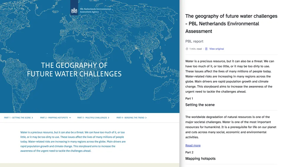
- First, a theme site based on the first publication: The Geography of Future Water Challenges (2018)
- with a spin-off tool for partners to use in their own reports: SDG tool (2019)
- followed by another tool, a set of interactive infographics that visualize current and future water challenges and adaptation strategies in river basins and deltas: River Basin Delta Tool (2020)
- and a major accessibility improvement for the RBDT (2021)
- followed by an in-depth exploration of the theme site: Bending The Trend (2022, 2023)
- and two more Shortreads that convey the messages in 10 to 15 minutes: Shortread - Bending the Trend (2023) and Shortread - Deltas and Coasts (2024)